Thursday 17 November 2011

At the seaside...coastal decor


coastal hallway decor

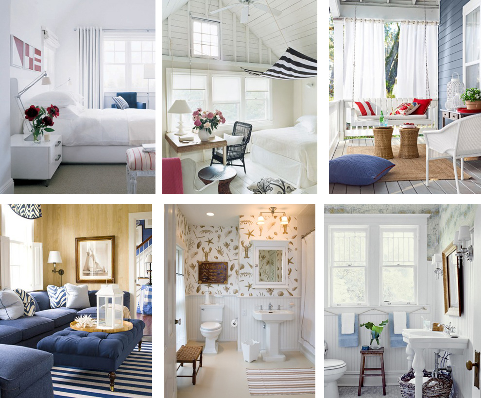
Sunny days, cool breezes, soothing waves and light fabrics floating softly in the air... memories of summer by the coast. Is there truly anything more relaxing or romantic than the sea side? As winter fast approaches we can't help but remember the wonderful days spent on the beach daydreaming in the romantic wisps of the summer breeze. It is only natural to want this memory as part of our daily lives. Coastal decor could not only provide you with the impression of sunny days but bring the cool and carefree romance of the seaside into your home...

nautical rope decor and rope decor detail

The use of white and blue give an air of lightness and tranquility. The use of wood and rope gives the impression of nature and sailing. These are best for details and accessories. Stripes are very nautical and  accents of red make it more so. Some flowers of pastel shades would add more romance to your decor.

I stumbled upon these amazing images of nautical style on stylecarrot.com. Click here to see more of their images. 


Some amazing detail work with strategically placed oars and rope. (below)

source

For a nautical/coastal look try a combination of the pieces in the mood board  below. Stick to the simple color pallet and the woven texture and it will be plain sailing.


You will find that this is a very strong look for one's home and therefore not for the fainthearted or the seasick. Begin with light airy colors and be inspired by the romance and adventure of the seaside. 
Happy sailing,

xx christina xx


Wednesday 12 October 2011

TREND: ACID...dare to be Bright


source unknown

Alas the sunny days of summer are gone and a nippy autumn creeps in to take its place. Skies once clear and bright are now dull and grey, and our sunnies have been stored away. But fret not boys and girls because we're bringing in the brights! And not just brights but really bright brights!!! So get your sunnies back on because its about to get ACID bright!

As you may have noticed by now the key word today is bright. Bright colors are now bang on trend for home decor. For those that love color in abundance, this is definitely for you. For those that don't I say...come on, live a little. There are so many ways of infusing color into a room. Through paint, furniture, wallpaper, lighting, accessories...the list is endless.


Use bright little accessories to brighten up your space. Try different combinations of color to really achieve a bold effect.

acid bright wall and furniture, source unknown


I absolutely love everything in the setting above. The wallpaper is as exquisite as the color of the chaise. And those tasty little cakes on their stand are a lovely feast for the eye.


source unknown


Contrast. Contrast. Contrast. That is the one way of ensuring that color pops. As you can see, the purple brightens the yellow of the lemons. 


This delightful lamp in purple would suit a yellow or orange background and brighten up your space. Speaking of bright colored lamps, this season there are some great lamps available in a variety colors at BHS. So don't hesitate to check them out.


When playing with bold color, try everything. you might be surprised by the results. Mix and match color and textures to achieve the best and brightest effects. For more modern looks try white walls and have only furniture and accessories in color. For more classic/quirky looks try bright vintage wallpaper and vintage accessories (as below). 
Acid bright mood board by yours truly

Try different color combinations to make things pop. Try yellows with purples, greens with reds, blues with oranges... Embrace this season of color and dare to be bright. Happy coloring!

xx christina xx

Wednesday 5 October 2011

Retro


Listening to the Ronettes, the Beatles and the Beegees gets me thinking about a chilled out and groovy era that we call 'retro'. The era that brought us rock and roll, funk and soul; that is the 50s to the 70s was the era of contemporary and modern interiors.

In the 50s, people loved bold patterns for wallpapers and fabrics, but went for elegant, modern furniture that floated magically above the floor on slender legs. The 60s produced a diverse range of styles, from country cottage pine to blow-up chairs. The classic retro look is typified by long, low, teak sideboards and coffee tables. In the 70s the love affair with teak continued, but the new look was pine. 70s furniture also had a chunkier feel to that from the 60s.


What I love most about retro decor is the bold prints and pops of color. I love the eclectic nature of its time as well. For those that love vintage, rock n roll, eclectic and bold styles this definitely the style for you.


When doing retro, one cannot afford to be shy. One needs to embrace color, form and print fully. Experimenting with color and pattern could bring quirky and stylish outcomes. Adding a few vintage accessories here and there in pop colors could really tie in the space. 


This is by far one of my favorite retro looks. The low hanging pendant light is ultra modern and the floor light adds extra oomph. Tho colors are perfect. The throw pillows are all different and yet still work within the retro scheme. Everything seems in its place, sleek and fresh.


I absolutely fall in love with the dog-tooth print on the throw pillows and the barely there blue of the lampshades in this space. Also, the star-burst mirrors are 'oh so retro'.


There's something so tasty about pops of color complementing each other in a space. The teal and yellow above and the aqua and red below work well together to bring a retro vibe to the space. Accessorizing with colorful objects gives a great contrast to the spaces.


With that said, my advice comes in three words. Color. Pattern. Vintage. Keep it quirky and colorful and you can't go wrong. 
P.s, I thought it's only fit to complete the retro look with a classic hit by The Ronettes 'Be my baby'. 


Be my baby- The Ronettes

Enjoy.

xx christina xx

Friday 23 September 2011

THE ULTIMATE BACHELOR PAD...bedroom


You bring your date home, head up to your bedroom in a steamy affair and as soon as the lights go on the needle screeches of the record... not what she expected. The mood is lost as you shove all your clothes off your bed and onto the piles of muck on your floor. She makes an excuse to leave, trips over your laptop cables and concludes your night of 'passion'. Not what you expected right? If you have been in a similar situation as a bachelor I urge you to read on for your own good.

Heaps of clothing strewn about the floor, pizza boxes from last weekend and electrical cables do not qualify for sexy bedroom decor. It's a complete turn-off for a woman to find your bedroom looking like it has been hit by a tornado. Boys, it's time to put order to chaos, to bring sophistication and character to your room and in the words of Justin Timberlake, it's time to 'bring sexy back'.

First things first, you need a comfortable and attractive bed. Have a matching set of clean sheets, duvet and pillows. Four pillows are better than one. Trust me, the extra three pillows will come in handy when having a guest over. Make sure to change the bedding every 2 weeks, (no exceptions) so have 2 or more sets of bedding. It is essential to have a bedside table to place you alarm clock, watch, table lamp etc. Invest in one that has a drawer for storage and in the same style and finish as your bed. 


Next, tidy up your space. Invest in storage, shelving and laundry baskets. Clear your room of clutter, magazines and cables. Let everything have its place. The floor should be visible and spotless. Also, try to keep your laundry basket in a separate space when having a guest and try to do the laundry as often as you can.

Reflect your personality with your choice of art. There's a thin line between tasteful and trashy. So refrain from putting up posters of naked/practically naked women. This is not to say that there cant be any nude/nude-ish imagery. The key is to be tasteful. If in doubt, go for abstract art. And FYI, pictures of your mom belong in the living room and ex-girlfriend snaps belong in an album tucked far far away from reach.


As for lighting, the same applies for your whole bachelor pad. The rule of thumb is having more than one light source. Bedside lamps, table lamps and floor lamps are essential in creating a seductive ambiance. Additionally, a dimmer switch or candles would add the extra oomph.

 mood board by yours truly


For those who like color and don't know how to use it, try softer muted shades of grey, cream, blue or brown. Add pops of color with plants, art and  pillows. Tie in strong colors like black, navy blue and silver for a more masculine feel.


It is important to have extras. Throws, plants, curtains etc., introduce a softness to your room and reduce the harsh and neutral feel of the space.


Now you have everything you need to make your bachelor bedroom 'Man-room' comfortable and seductive. Think intimate, sophisticated and inviting, and it will be hard for any girl to leave. Go on boys, bring sexy back!


xx christina xx


Saturday 17 September 2011

2D-3D... Issey Miyake store, Tokyo

Front view of the Issey Miyake store window display
I came across these 2D-3D chair display byYoichi Yamamoto for Issey Miyake in the dezeen magazine. I think they look so cool as window display for the store in Tokyo. The backs of the chairs stand up on the stage and the rest of the chair (legs) are painted onto the floor. From a fixed angle they appear to be in the correct perspective. Contrasting hats then accessorize the intsallation. 


Side view of the Issey Miyake store window display


Below are some of the close-ups of the 2D-3D atrwork. I absolutely love the colour of these chairs against the white floor as well. I also love how the yellows, limes and the oranges pop out of the display. 

 2D-3D installation close up

Installation in use

 Installation in use


Hope this gives you some inspiration on any 2D-3D projects you might have. And for more images and technical drawings (plans and elevations) of how they did it click here. Be inspired...

xx christina xx


Friday 16 September 2011

Voilà...le glass jars

Table display from on home design

Varying fillings of fruit, candles, leaves and feathers in various size glass jars makes for a lovely table display. I love the rich combination of colours, textures and sizes. This would definitely make a great display in a kitchen or dining area.

xx christina xx


Thursday 15 September 2011

QUOTE OF THE DAY 15.09.11


"A design isn't finished until somebody's using it."
                                            
                                                                                    Brenda Laurel


Wednesday 14 September 2011

TREND: GREEN


Green has never been my favourite colour. I've tried to love it and have failed on many occasions. I don't particularly like it on clothing, nail varnish , accessories but somehow I like it in interiors. Therefore I am learning to embrace green and the more I do, the more flexible I feel towards it. And it helps to have inspiration in order to embrace a colour you don't particularly like but works on so many levels. So, welcome to my discovery of green...


"Green is a colour that symbolises nature, regeneration and vitality. Green has become the symbol for environmentalism. It is the colour of nature so with our growing awareness surrounding sustainability, colour inspired by our natural environment soothes our minds.


Green brings nature indoors creating a botanical setting filled with tranquillity. In the home, green is perfect for refreshing and revitalising a room. This colour works particularly well where serenity is desired like within bedrooms, bathrooms and living rooms.


For a delicate effect, start with soft olive tones which can create understated living rooms. Calming jades are perfect for bathrooms offering a relaxing environment for you to unwind. Vibrant limes will add some energy to your room and look particularly contemporary when combined with cool neutrals like grey.
                                                                                                                                              

Muted greens inspired by aloe, cactus and herbs offer subtle shades which can be combined beautifully. Calm greens like Watercolour Green and Overtly Olive demonstrate this soft effect and work particularly well in open plan spaces where the garden enhances the soothing colours."

                                                                                                                                          - Dulux

I think the reason I didn't like green was because I had a particular green in mind that I was totally against but looking at natural shades of green in leaves, in stones and in fruits helped me to discover shades that were much suited to my liking. This helped me broaden my colour scheme.


If you're used to picking the same colours or are a little bit afraid of change, my suggestion is to browse around for inspiration a little bit more than your norm. Trying new things could open you up to amazing possibilities. I can now say that I'm starting to embrace green, I'm giving it a little smooch and I'm deliciously interested in making the most of it.

xx christina xx