Showing posts with label home décor. Show all posts

Thursday, 4 April 2013

World Class - Africa!


Kicking off the 'World Class' series is Africa; my favourite continent and a source of inspirational interiors or myself and many others. From the calming shores of Lamu in East Africa to the rich souks (markets) of Morocco in North Africa comes all sorts of colour, vibrance, texture and variety. We embark on our exciting journey around this rich continent beginning with Morocco, then onto Lamu and last but certainly not least to the Cape in South Africa. Looking for a sense of adventure in your home? Go on and bring the inspiration of the African interior into your space. Happy travels!

MOROCCO

Morrocan Living room

Two toned wall with Ornamental mirror and cabinets
Decorative lantern

Quick tips for a moroccan style: 
1. Light but warm coloured walls... like soft pinks with brown... corals etc.
2. Accent colour with shades of (green and red) or (pink and gold) or hues of blue.
3. Metallic ornaments such as trays and tea sets, mirror frames, lanterns.
4. Intricate textures and patterns.

For more on the Moroccan style see my previous post 'Take me to Morocco' here.


EAST AFRICA: LAMU


Quick tips for a coastal Lamu style:
1. Off-white plastered and textured walls to keep the house cool.
2. Warm browns and rusty red accents.
3. Flowing and/or sheer white fabrics draped casually over bedposts or as room dividers. 
4. Intricately carved wood and stone features, and patterned ornaments.


SOUTH AFRICA


Indoor-outdoor fireplace

Quick tips for a South African safari style:
1. Neutral or ochre coloured walls with a bit of texture.
2. Rich and warm colour accents.
3. Dark wooden furniture and decorative elements.
4. Soft lighting through table lamps and fireplaces


Must haves: A must have for an African inspired interior is pattern. From intricate and delicate to bold and graphic, patterns are the consistent element in African decor. Select an inspiring pattern, see which of the above styles it compliments and transform your space instantly. Explore your sense of adventure!   

Christina

Wednesday, 13 February 2013

The ABCs!!


The ABCs of Interiors... learn your way through to an amazing interior! Class is in session!

Christina.

Image my own

Tuesday, 31 January 2012

NEW MOOD.BOARD RETRO

RETRO 


I did the post on RETRO decor a while back and realized that I hadn't done a mood.board for it. So, here it is finally. Enjoy.

xx christina xx

Thursday, 12 January 2012

Air of Romance


With each new year we all make resolutions that we swear to see through. There's always that thing we want to do or that thing we want to get or something we want to change. We make promises to eat healthier, sign up for that gym membership, quit smoking, get our lives organised...the list is endless. This year I realized that life needs, well, more life! More laughter, inspiration, spontaneity, purity, sensuality and last but not least more romance. 

Romance I fear has been somewhat lost to our generation, only to be found in books that hardly anyone reads. Furthermore, romance has become associated to many teenagers' delight with fictional characters in Vampire movies and series. Anyway, that's besides the point. Whatever your idea of romance is, pursue it... Consequently, In my pursuit, I have compiled some images of inspiration of the 'air of romance'.


The key to a romantic setting is light. Soft light seeping through light and sheer curtains that billow in the slight breeze.

The second key to romance is in the details and embellishments. Hand-carved, hand-painted, hand-stitched and hand-drawn artifacts give the impression of time and care put into them. Additionally, they imply that each one of them is unique to its owner, its time and place. 

embellished bedroom


Sometimes romance is simplistic.


white and silver bedroom

Other times elaborate. 

fairy tale inspired cradle by Giusti Portos

Romantic bathroom designed by Servio Firmino

Other times mysterious.


Sometimes innocent and playful.


There's so much more to romance than we can possibly imagine or put together. Our idea of it varies from one person to the other. I hope however that we all seek it... after all, what harm could come of it? Thus with these few words I bid you all good wishes for the new year and a year full of romance.


Disclaimer: I do not own these images and I have not referenced some because I collected them a while back. I have referenced those I could. 

Thursday, 17 November 2011

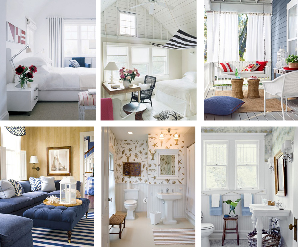
At the seaside...coastal decor


coastal hallway decor

Sunny days, cool breezes, soothing waves and light fabrics floating softly in the air... memories of summer by the coast. Is there truly anything more relaxing or romantic than the sea side? As winter fast approaches we can't help but remember the wonderful days spent on the beach daydreaming in the romantic wisps of the summer breeze. It is only natural to want this memory as part of our daily lives. Coastal decor could not only provide you with the impression of sunny days but bring the cool and carefree romance of the seaside into your home...

nautical rope decor and rope decor detail

The use of white and blue give an air of lightness and tranquility. The use of wood and rope gives the impression of nature and sailing. These are best for details and accessories. Stripes are very nautical and  accents of red make it more so. Some flowers of pastel shades would add more romance to your decor.

I stumbled upon these amazing images of nautical style on stylecarrot.com. Click here to see more of their images. 


Some amazing detail work with strategically placed oars and rope. (below)

source

For a nautical/coastal look try a combination of the pieces in the mood board  below. Stick to the simple color pallet and the woven texture and it will be plain sailing.


You will find that this is a very strong look for one's home and therefore not for the fainthearted or the seasick. Begin with light airy colors and be inspired by the romance and adventure of the seaside. 
Happy sailing,

xx christina xx


Wednesday, 12 October 2011

TREND: ACID...dare to be Bright


source unknown

Alas the sunny days of summer are gone and a nippy autumn creeps in to take its place. Skies once clear and bright are now dull and grey, and our sunnies have been stored away. But fret not boys and girls because we're bringing in the brights! And not just brights but really bright brights!!! So get your sunnies back on because its about to get ACID bright!

As you may have noticed by now the key word today is bright. Bright colors are now bang on trend for home decor. For those that love color in abundance, this is definitely for you. For those that don't I say...come on, live a little. There are so many ways of infusing color into a room. Through paint, furniture, wallpaper, lighting, accessories...the list is endless.


Use bright little accessories to brighten up your space. Try different combinations of color to really achieve a bold effect.

acid bright wall and furniture, source unknown


I absolutely love everything in the setting above. The wallpaper is as exquisite as the color of the chaise. And those tasty little cakes on their stand are a lovely feast for the eye.


source unknown


Contrast. Contrast. Contrast. That is the one way of ensuring that color pops. As you can see, the purple brightens the yellow of the lemons. 


This delightful lamp in purple would suit a yellow or orange background and brighten up your space. Speaking of bright colored lamps, this season there are some great lamps available in a variety colors at BHS. So don't hesitate to check them out.


When playing with bold color, try everything. you might be surprised by the results. Mix and match color and textures to achieve the best and brightest effects. For more modern looks try white walls and have only furniture and accessories in color. For more classic/quirky looks try bright vintage wallpaper and vintage accessories (as below). 
Acid bright mood board by yours truly

Try different color combinations to make things pop. Try yellows with purples, greens with reds, blues with oranges... Embrace this season of color and dare to be bright. Happy coloring!

xx christina xx

Wednesday, 5 October 2011

Retro


Listening to the Ronettes, the Beatles and the Beegees gets me thinking about a chilled out and groovy era that we call 'retro'. The era that brought us rock and roll, funk and soul; that is the 50s to the 70s was the era of contemporary and modern interiors.

In the 50s, people loved bold patterns for wallpapers and fabrics, but went for elegant, modern furniture that floated magically above the floor on slender legs. The 60s produced a diverse range of styles, from country cottage pine to blow-up chairs. The classic retro look is typified by long, low, teak sideboards and coffee tables. In the 70s the love affair with teak continued, but the new look was pine. 70s furniture also had a chunkier feel to that from the 60s.


What I love most about retro decor is the bold prints and pops of color. I love the eclectic nature of its time as well. For those that love vintage, rock n roll, eclectic and bold styles this definitely the style for you.


When doing retro, one cannot afford to be shy. One needs to embrace color, form and print fully. Experimenting with color and pattern could bring quirky and stylish outcomes. Adding a few vintage accessories here and there in pop colors could really tie in the space. 


This is by far one of my favorite retro looks. The low hanging pendant light is ultra modern and the floor light adds extra oomph. Tho colors are perfect. The throw pillows are all different and yet still work within the retro scheme. Everything seems in its place, sleek and fresh.


I absolutely fall in love with the dog-tooth print on the throw pillows and the barely there blue of the lampshades in this space. Also, the star-burst mirrors are 'oh so retro'.


There's something so tasty about pops of color complementing each other in a space. The teal and yellow above and the aqua and red below work well together to bring a retro vibe to the space. Accessorizing with colorful objects gives a great contrast to the spaces.


With that said, my advice comes in three words. Color. Pattern. Vintage. Keep it quirky and colorful and you can't go wrong. 
P.s, I thought it's only fit to complete the retro look with a classic hit by The Ronettes 'Be my baby'. 


Be my baby- The Ronettes

Enjoy.

xx christina xx